

The History of Web Design
Web-Volution talks about the history of web design, the new web features and design trends that emerged throughout the years, evolving into the web design


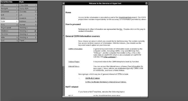
1990 - The World Wide Web
Invented by British computer scientist Tim Berners Lee, the World Wide Web was the world’s first browser, created for different computers to access the same information/documents easily.
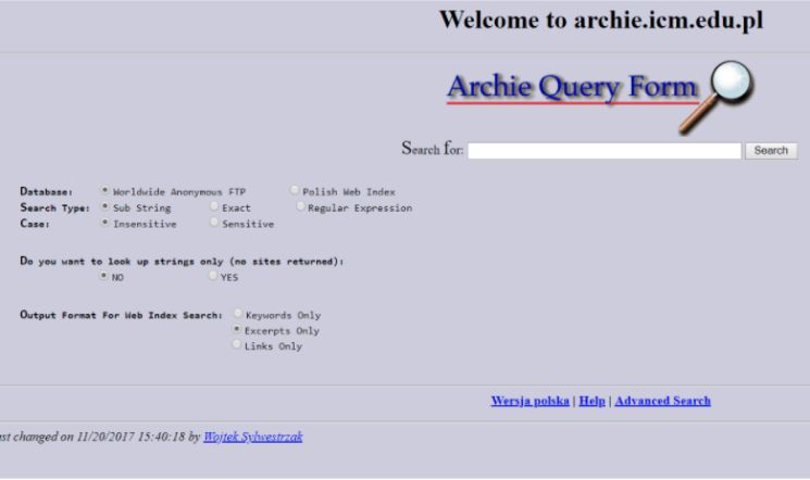
Grandfather Of All Search Engines
Archie is considered to be the first Internet search engine. It scanned FTP (File Transfer Protocol) sites to create an index of downloadable files.
Due to its limited capabilities, the content of each site wasn’t available, only the listings were.
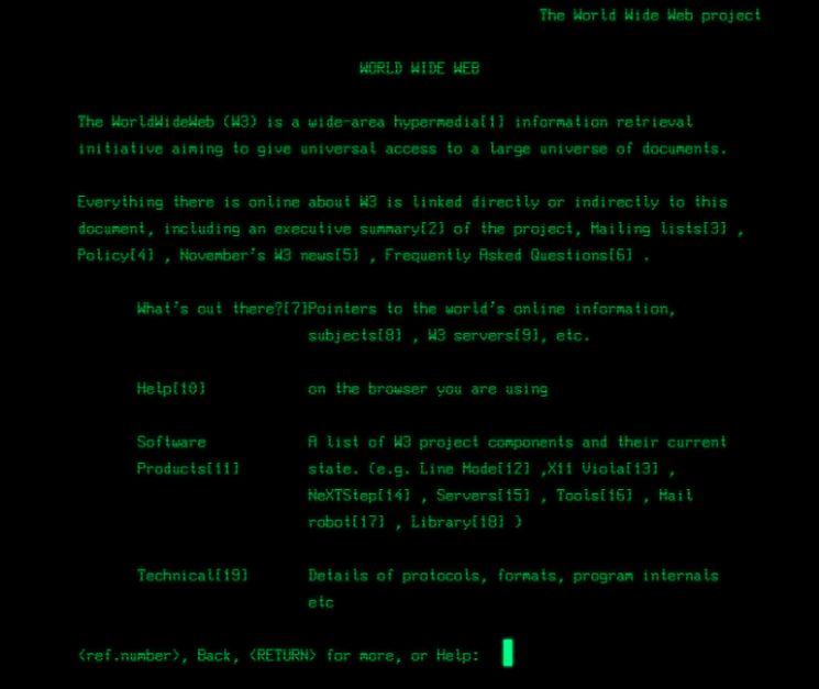
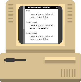
1991 - The Dark Age
Line Mode Browser was the second browser ever made for the World Wide Web.
Similar to the World Wide Web, Line Mode browser was a text-only browser, but this time it was on a black screen.
As designers could only work on black screens with texts and pixels, this period became known as the dark age. Following Line Mode Browser, other browsers that emerged in the dark age include Lynx, w3m and links.
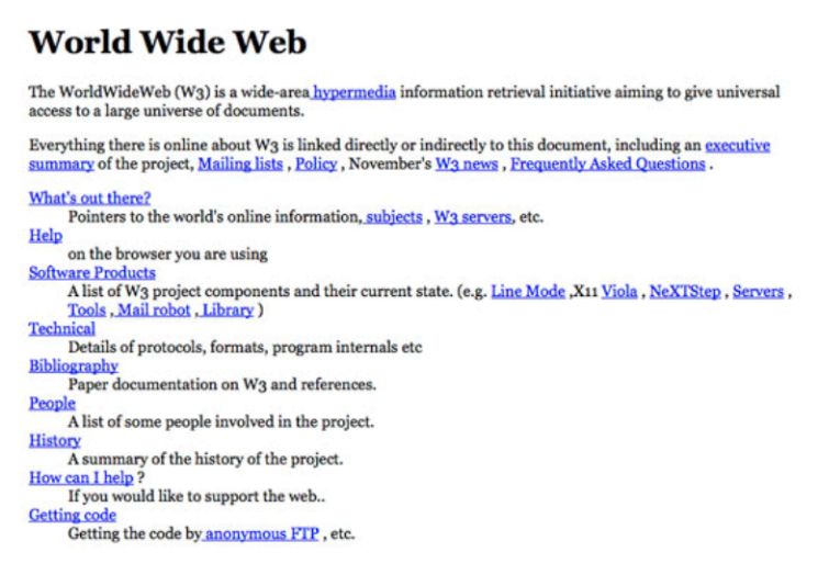
Revisit The First Ever Website Created
The first-ever website went live on August 6, 1991. It was brought back to life at its original URL. You can view the site here.


1992 - The First Graphical Browser: Erwise
Prior to the well known Mosaic Browser, Erwise was the first graphical web browser, developed by four Finnish college students in 1991. It was more advanced than Mosaic but was not commercialised due to a lack of funding.
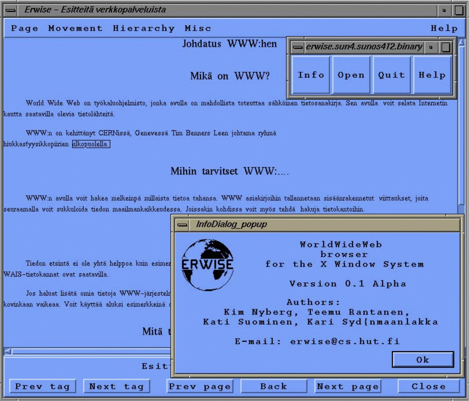
(Erwise Browser in 1992)
1993 - Mosaic Browser: The First Popular Web Browser
Mosaic was the first “easy to use” browser as it enabled users to view multiple images within a single page space. This was a big upgrade as previous browsers were only capable of displaying images in different windows. Mosaic was able to quickly generate a fan following and gain popularity due to its icons, bookmarks and attractive interface.
With Mosaic, the internet reached a new stratosphere of visual user experience, with web design on the forefront.
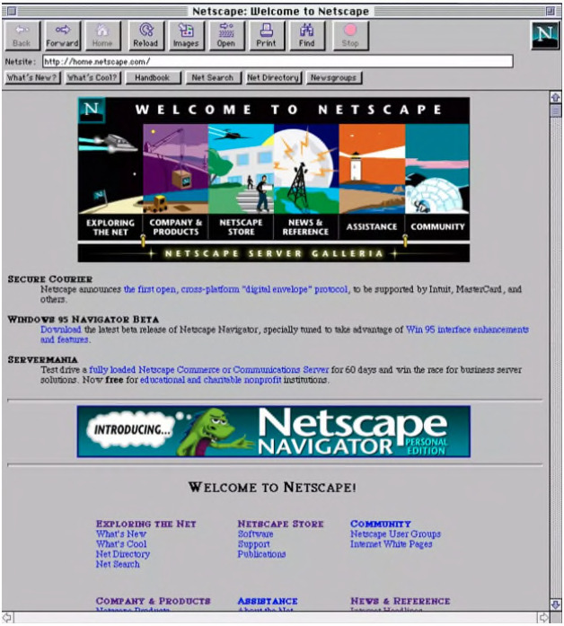
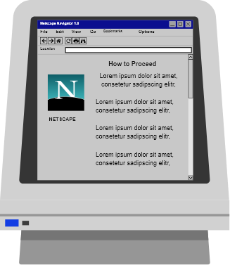
1994 - Netscape Launches Netscape Navigator
Netscape Navigator 1.0 was released on December 15, 1994, making it easier for users to browse online. It was wildly popular and introduced millions of people to the world wide web for the first time. Before Netscape Navigator, the internet was an abstract concept, used primarily by the military and academia.
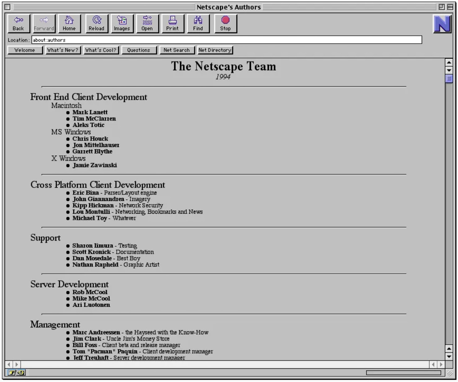
Mosaic Netscape 0.9 Beta for Windows (1994)
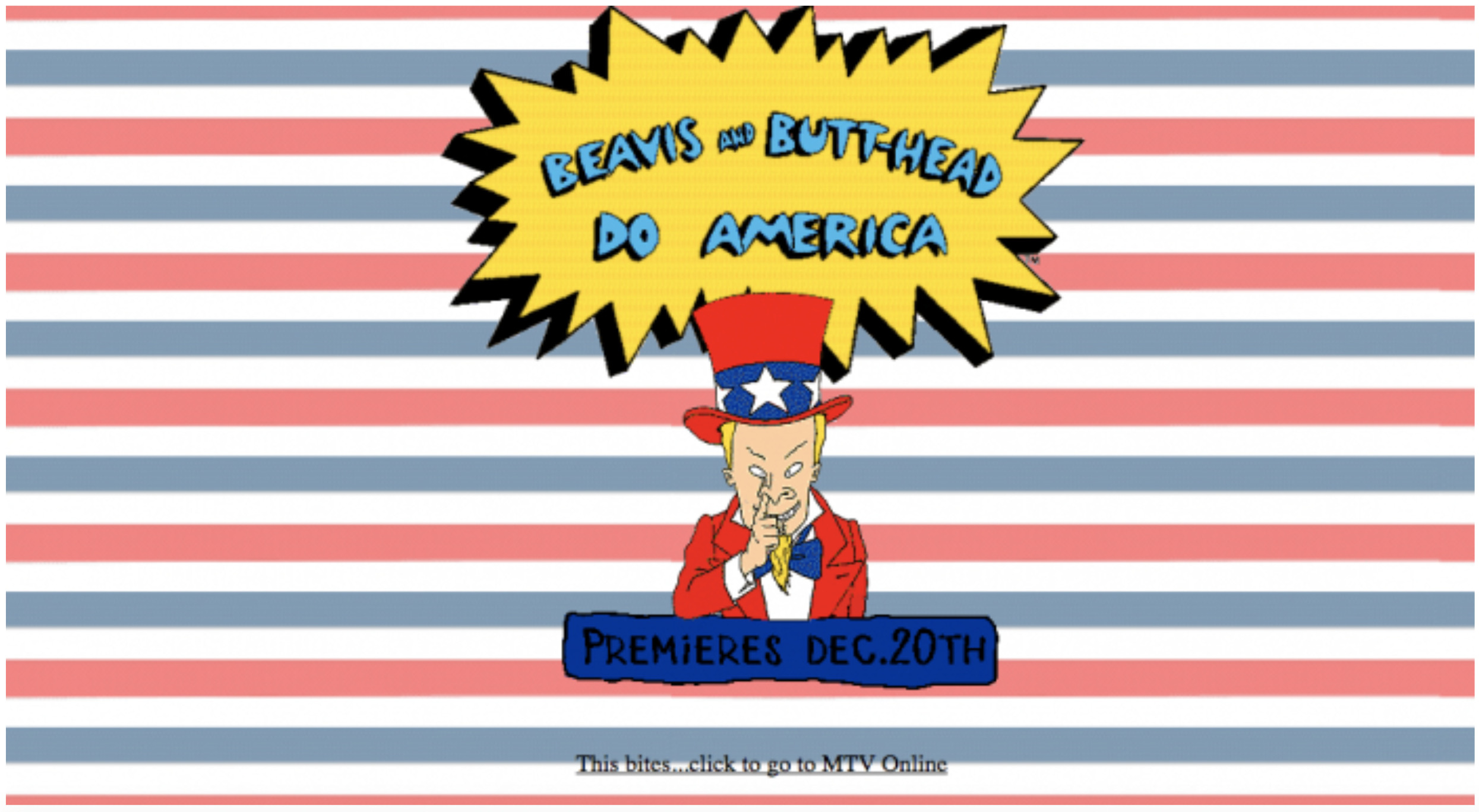
The First Graphic Landing Page
MTV launched its website in 1993 and was the first to publish a fully graphical landing web page.
The First Ad Banner Created
The first ad banner was purchased by AT&T on HotWired.com in 1994. This ad was clicked on by 44% of people who saw it and it created an undeniable buzz amongst advertisers and consumers alike.


1995 - Table Based Websites
Before the introduction of tables as a web page structure, there were few design components in websites, and there was no way to emulate the layouts of conventional printed documents.
The main benefit of using tables was that it allowed designers to arrange text and graphics easily. At that time, many developers also disliked front-end coding as the way of coding was more complex than methods that came later.

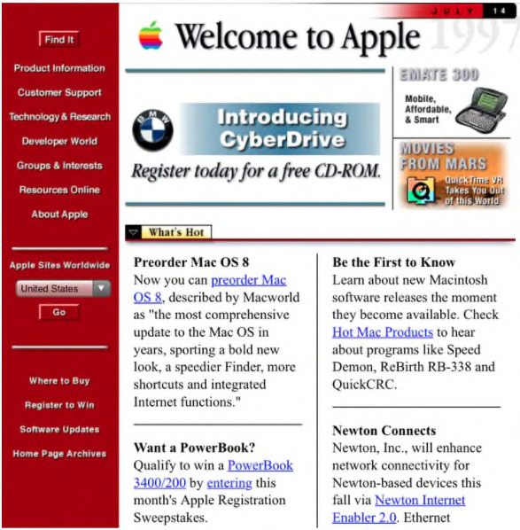
(Apple website, screenshot from 1996)
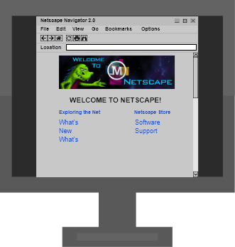
1995 - JavaScript
The first public release of JavaScript was integrated into Netscape Navigator 2.0 and released in 1995.
It allowed the implementation of complex features on web pages such as displaying timely content updates, interactive maps, animated 2D/3D graphics, scrolling video jukeboxes, and the like.
(Netscape Navigator 2.0, screenshot from 1995)

1996 - The Rise Of Flash
Initially known as FutureSplash, Adobe Flash gave web designers the freedom to create more dynamic websites by integrating animation, video, and audio. Thus began the golden era for splash pages, intro animations, and all kinds of interactive effects.
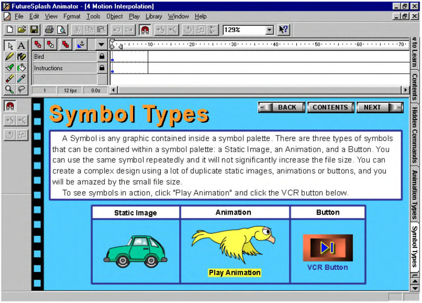
(FutureSplash Animator, 1996)
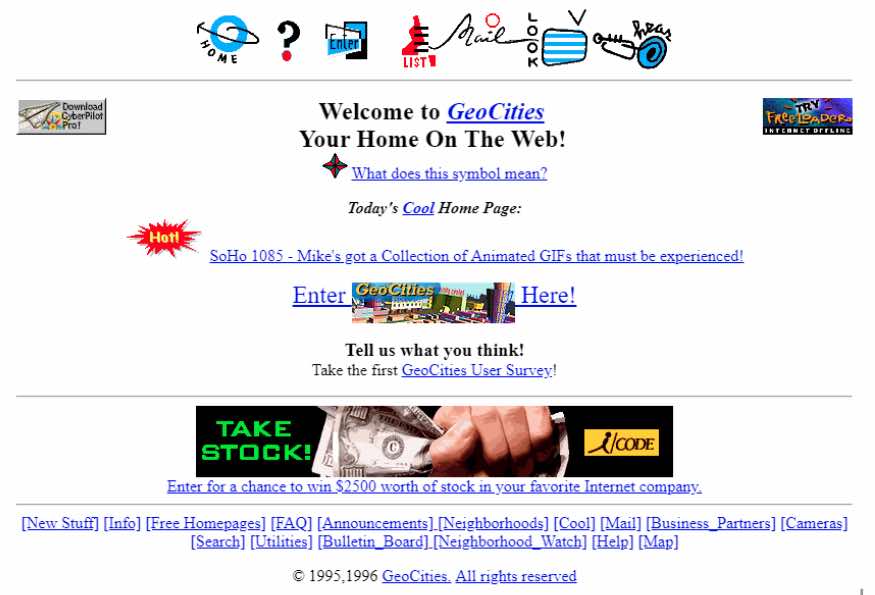
1994 - Geocities
“The original concept of the service was to create a virtual community of websites organized in "internet cities". In its early years, GeoCities offered its users an unprecedented 2 MB of free disk space. In 1999, GeoCities was bought by Yahoo! and ten years later, on October 26, 2009, Yahoo! definitively terminated the GeoCities service.”
Geocities was a web hosting service launched in 1994. It allowed users to create and host websites for free. Geocities was essentially an organization of user-created homepages in different topical communities like sports, entertainment, and tech, which were known as “neighbourhoods”.
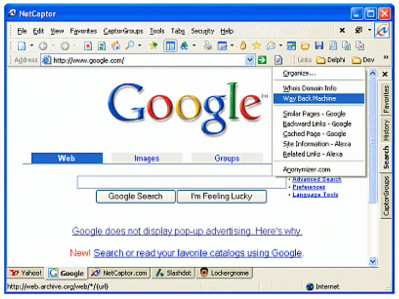
1997 - Invention Of The Browser Tab
The first tabbed browser was actually NetCaptor, a re-skinned Internet Explorer that first appeared back in 1997.
Users would have noticed a peculiar feature at the bottom of the browser window: small grey boxes, each corresponding to a different web page, which could be toggled between by clicking.
Those boxes were the first browser tabs, the now-standard unit of internet navigation.


In Web 2.0, users could now not only read the content but also write, modify and update content online. The birth of Web 2.0 provoked a strong social impact as it allowed users to interact and collaborate with each other through social media.
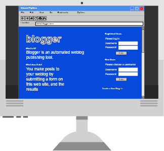
1999 - User-Generated Content
LiveJournal (Launched in April, 1999) and Blogger (Launched in August, 1999) marked the beginning of Web 2.0.
Now, even a non-technical user could actively interact & contribute to the web using different blog or social platforms. Every user now had the ability to contribute content and interact with other web users.
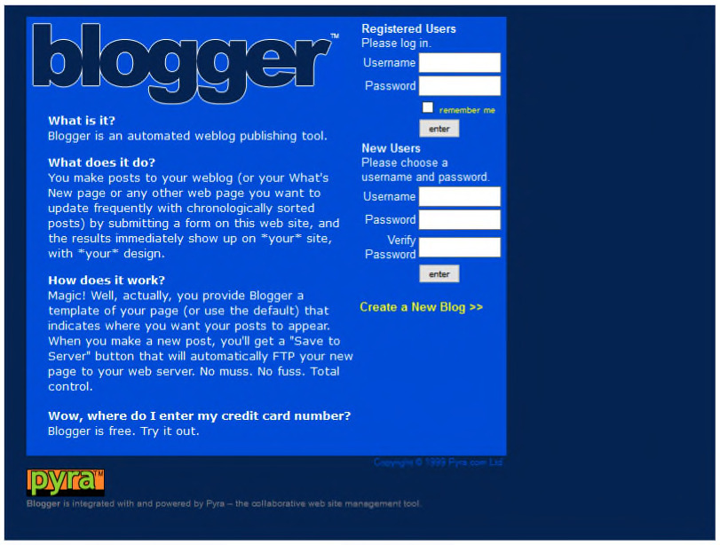
Blogger in 1999
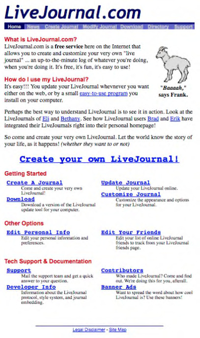
LiveJournal in 1999
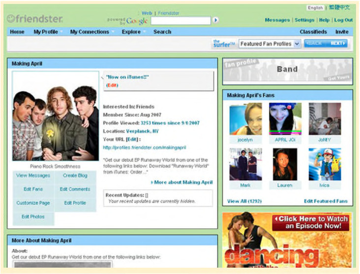
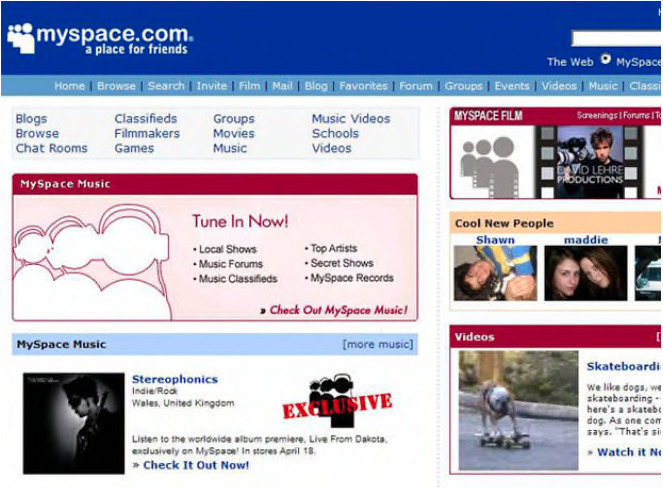
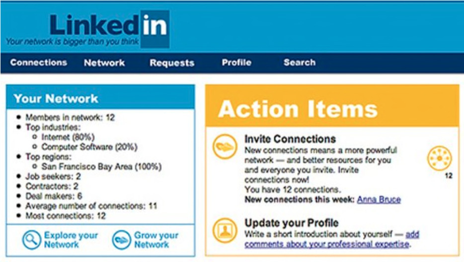
2002 - 2003 The Rise Of Social Networks
(Friendster, My Space, LinkedIn)
During this period, social networking platforms emerged and were widely popular among users. These platforms allowed users to post their own content and interact with others.
Friendster - Friendster’s service allowed users to contact other members, maintain those contacts, and share online content and media with those contacts. The website was also used for dating and discovering new events, bands and hobbies. Users could share videos, photos, messages and comments with other members via profiles and networks. Its founders hoped web interactions would spur face-to-face relationships among users.
My Space - From 2005 until early 2008, Myspace was the most visited social networking site in the world, attracting 75.9 million unique visitors a month at its 2008 peak. It surpassed Google as the most visited website in the United States in 2006.
2003 - LinkedIn LinkedIn went live on 5th May 2003. It is one of the oldest mainstream social platforms. Its mission statement was created to connect the world’s professionals to make them more productive and successful. At the end of its first month of full operation, LinkedIn had a total of 4,500 members in the network, but on a bad day, it would only get 20 signups.
2003 - Wordpress Hits The Scene
WordPress, an open-source blogging system, was launched. It had a small selection of templates and an admin interface. The plugins architecture was introduced a year later which allowed developers to extend its functionality.
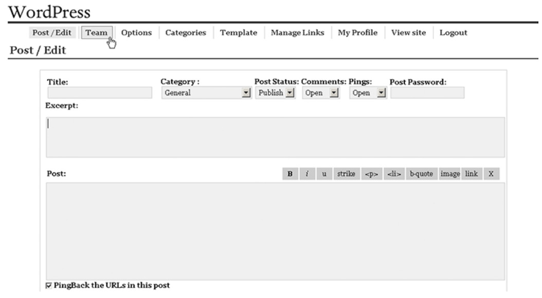
Wordpress in 2003
2003 - Skype
Skype was founded in 2003 by Niklas Zennström and Janus Friis, introducing audio conference calls.
Version 2.0 Beta was released in 2005. This version revolutionized the Internet call industry and paved way for the greatest and most expansive Internet communication app. It was the first to introduce video calling, using a simplified new design and interface.
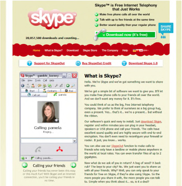
Skype in 2004
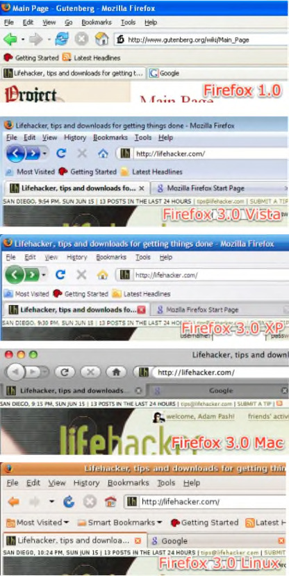
2004 - Mozilla Releases Firefox 1.0.
Firefox 1.0 was released in November 2004. It set itself apart from its competitor, IE6, by offering pop-up blocking, easier search (having the search box at the top right corner), tabbed browsing, and most importantly… add-ons!
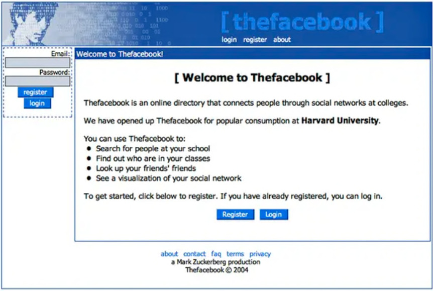
The Start Of Facebook
On February 2004, a Harvard sophomore named Mark Zuckerberg launched The Facebook (thefacebook.com), the first iteration of Facebook. It was a social media website he had built in order to connect Harvard students with one another. 4 years later, Facebook became one of the most influential social networks in the world, boasting approximately 2.2 billion monthly users.


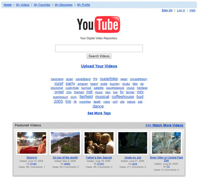
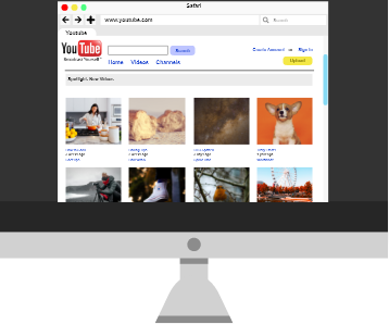
2005 - The Start Of YouTube
Long before Tinder existed, a little-known video site tried to play cupid to the Internet generation. The name of this site? YouTube.
The concept ultimately failed but had an exceptional video streaming and uploading platform. It has gone on to become one of the world’s most ubiquitous websites and has become one of the most visited websites in the history of the internet.
First Youtube Video Uploaded
In 2005, one of Youtube’s co-founders Jawed Karim posted the first-ever video on the platform.
The iconic 18-second video, titled "Me at the zoo," features Karim at the San Diego Zoo standing in front of a bunch of elephants.
Watch the video here.
Birth Of The iPhone
Today, smartphones are an essential in most of our daily lives, serving multiple purposes from making calls to taking photographs.
The iPhone first made its appearance on June 29, 2007. The huge success and usability of its full-size touch screen changed the industry in a matter of months.
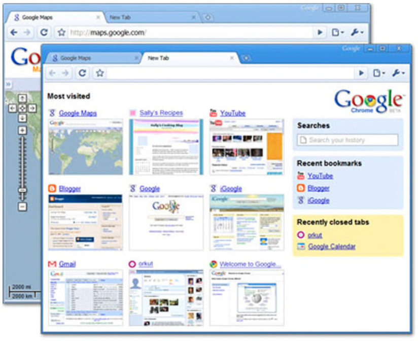
2008 - Google Releases The Chrome Web Browser
Google first released the Chrome Web Browser in 2008. It remains the most popular browser in the world even until today.
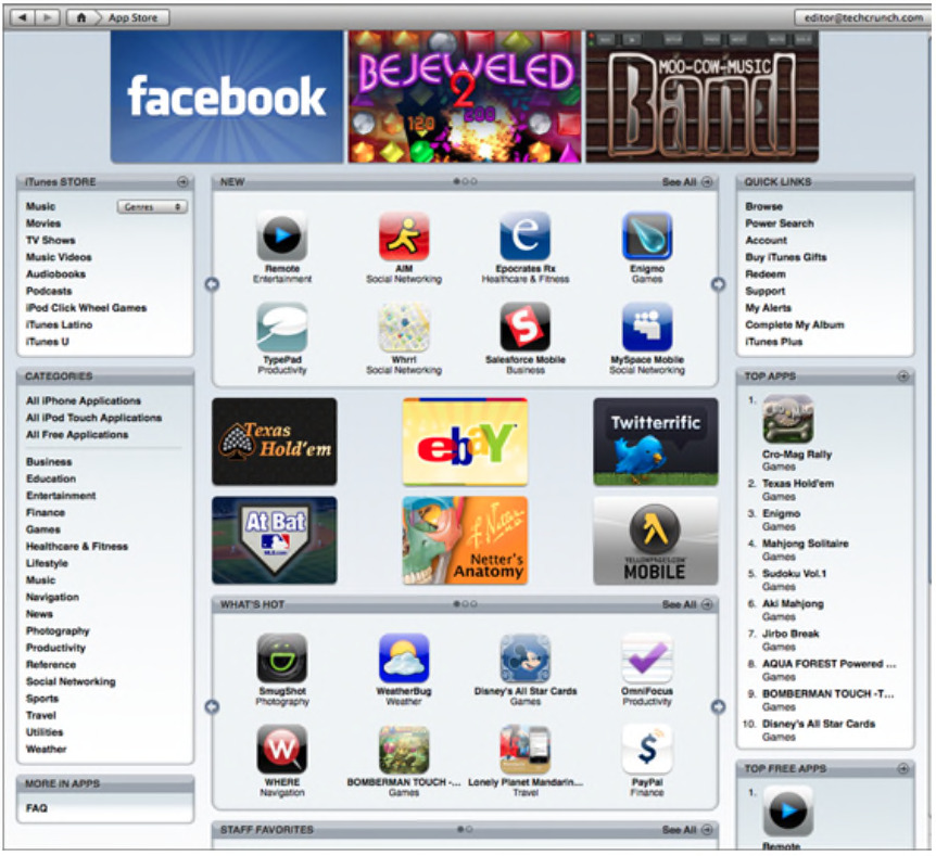
2008 - Launch Of The Apple App Store
When Apple introduced the App Store on July 10, 2008 with 500 apps, it ignited a cultural, social and economic phenomenon that changed the way people work, play, meet, travel and so much more.


2010 - Google Web Fonts Is Launched
Google launched Google Fonts in 2010 as an open-source web font library to provide web fonts for free. It is known and used widely by web designers and consists of almost 1000 font families today.
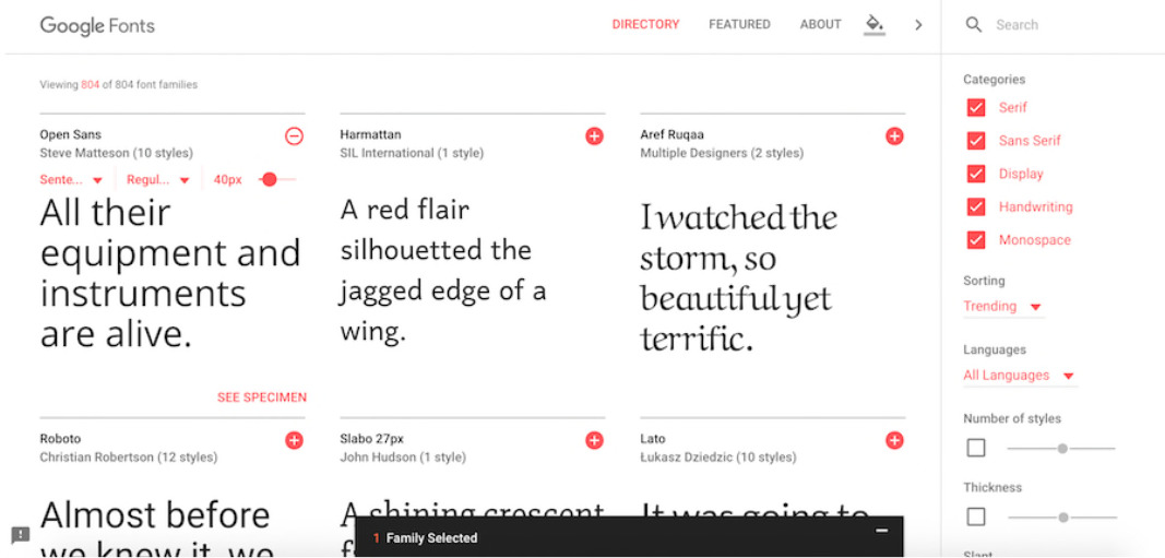
Highly accessible, one will have a huge selection of fonts that display beautifully on screen at their disposal. There is no need to sign up for accounts and there are no monthly fees to pay. All one has to do is add a line of code to their website in order to use the fonts.
2010 - Birth Of Responsive Web Design
The early 2010s gave way to the start of responsive web design, an approach that suggests that design and development should respond to the user’s screen size, platform and orientation.
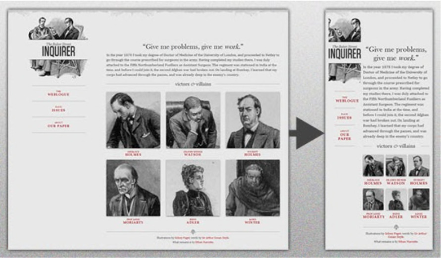
With the use of flexible images, flexible widths and media queries, web designers and developers were able to provide a high-quality, seamless experience for users on multiple devices.They automatically reorient and organize information differently for each device, ensuring that your website has the right design for every device.
Parallax Scrolling Gains Popularity
Parallax scrolling became popularized in web design as internet technology became more advanced. Parallax scrolling allows images to move around the website at different perspectives and speeds. This provides an ideal setting for engagement through storytelling.
In addition, parallax scrolling allows you to take your website visitors on a journey through your company, products, services, and other important features that are showcased on your website.
3D In Web
WebGL 1.0 was launched in 2011 as a cross-platform, royalty-free web standard that brings high-quality 3D graphics to web browsers.
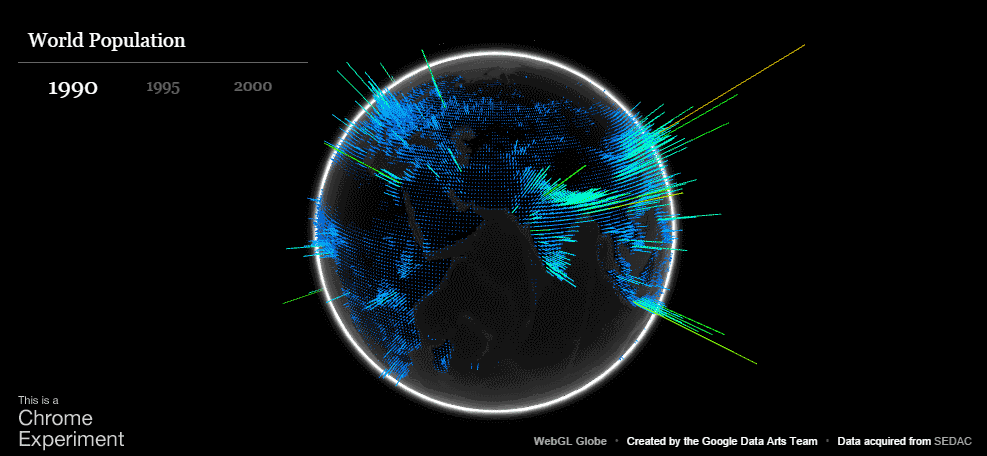
The graphics capabilities of WebGL are game-changing, with 3D and most of the richness from high-end games and interactive multimedia available.


2015 - Advanced Animations & Interactive Elements
As older web platforms like Flash began phasing out in favor of newer technologies like HTML5, CSS3, and front-end JavaScript frameworks, web designers and developers could create almost any interactive experience they could dream up.
Suddenly the web was filled with deeper and more engaging experiences, like scroll-based navigation, interactive backgrounds, location-based tools, and more. Check out this great example from Ava Sessions—the super-interactive and experimental one-page site created to promote the sci-fi film Ex Machina draws your portrait based on a webcam image or uploaded photo.
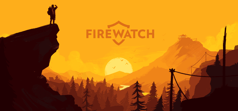
2015 - Bigger And More Dramatic Text
In 2015, bigger truly was better.
Monumental titles made a dramatic opening statement with distinct typefaces overlaid above high-definition background videos and images. The rest of the page content was hidden below the fold, and navigational elements like menus and search bars were made smaller or even eliminated altogether.

2015 - Flat Design 2.0 And More Minimalism
Stemming from a backlash against skeuomorphism that began with the iPhone, flat design and minimalism staged a dramatic comeback in 2015.
Unlike the truly flat designs of years gone by, web designers in 2015 included a few extra flourishes in their designs. Highlights, gradients, vibrant and playful colors, strong typography, and drop shadows all worked together to create simple yet effective designs without pretending each page element was a real object.
2016 - Duotones And Dynamic Typography
The trend toward minimal design continued as designers got creative with bold typography and bright images, pushing the boundaries of minimalism.
Duotone images became a popular design aesthetic, adding a splash of color and piquing visitors’ interest without distracting from the content. Brands like the KIKK Festival took advantage of duotone images to create a compelling and consistent, yet simple, design.
With the increased focus on visuals, designers also began playing with stylized typography. Pulling inspiration from the print world, headings became ever bigger and bolder, and services like Google Fonts and Adobe Typekit (now Adobe Fonts) made it incredibly easy for people to customize the fonts on their site. Designers could now rely on a third party to host the fonts and serve them to the end user rather than manage the font files directly and hope that users could see them properly.
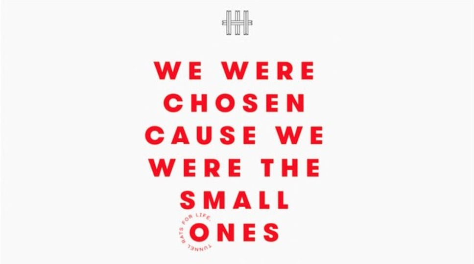
2016 - Dynamic Storytelling
Long-scrolling pages and high-definition images opened up new opportunities for online storytelling. Brands began creating immersive stories, combining video, images, and text into dynamic layouts and using scroll-based animations to build an immersive brand experience like no other.
A great example of this is Frames Collection’s Tunnel Rats.
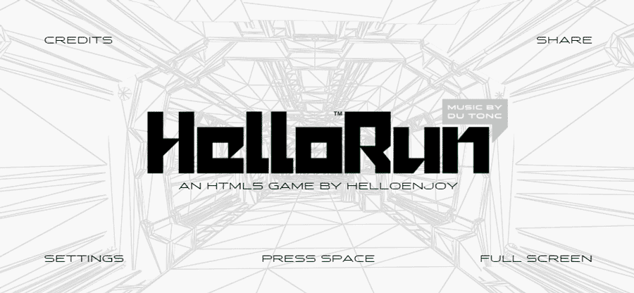
2017 - Gamification
The same improvements in download speed that made video backgrounds possible also brought new possibilities for interactive sites. 2017 was the year many browsers also began including native support for 3D elements via WebGL—designers could suddenly create engaging game-like experiences for visitors.

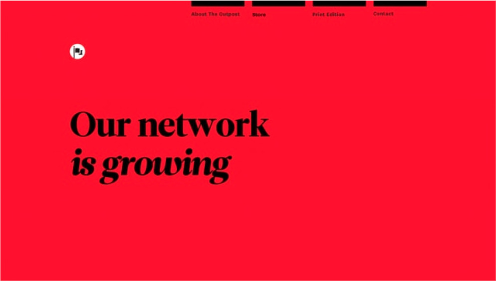
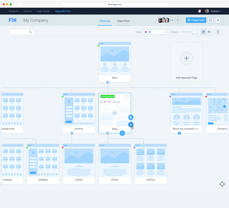
2018 - Animation And Illustration
Around 2018, every website looked nearly identical with a bold hero photo overlaid by a heading and CTA. Luckily designers agreed, and brands began to abandon the hero images in favor of stylized animations and custom illustrations.
FlowMapp, for example, used custom illustrations to highlight the benefits of their online planning tool.
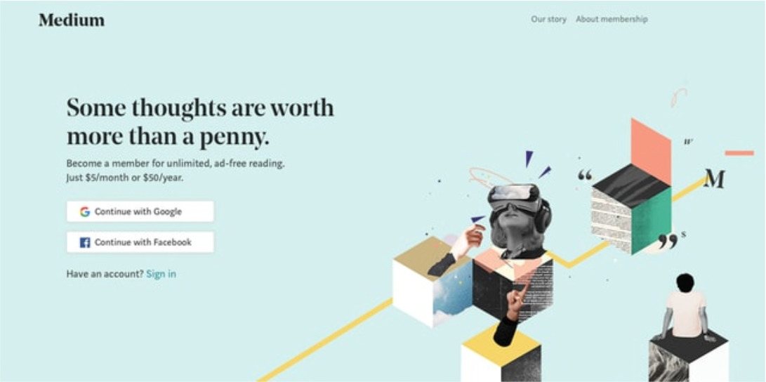
2019 - The Serif Comeback
Serif typefaces have traditionally been reserved for print design, while most web designers relied on their serif-less cousins to build their digital designs. While sans serif continues to be the preferred choice for body copy, brands like Medium have started making more traditional serif fonts a central part of their brand.
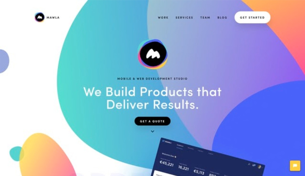
2019 - Natural, More Organic And Flowy Shapes
Designers continue pushing the envelope on how they lay out each site. New styling capabilities and layout tools are turning the geometric shapes and stark edges from the previous year into more natural, curved lines and shapes.
2019 - More Micro-Interactions
Designers start to feature more interactive elements designed to delight users. Page transitions, fading and sliding images, and subtly animated graphics all serve to make user experiences more rewarding and create an emotional connection with visitors.
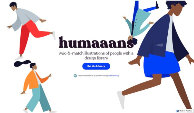
2019 - Diversity
2019 also brought a shift towards inclusive web design. The prior shift away from generic stock photos continues with brands including diverse images from all cultures, ages, and gender identities in their content.
Brands like MeUndies replaced photos of professional models with everyday people, making social acceptance a central part of their brand. Designers even created tools like Humaaans to let other designers mix and match illustrations for use in their own designs.


As much as we would like to predict which direction the web design industry will head next, there’s simply no way of knowing for sure. Designs from five years ago are already beginning to feel dated, and most modern websites are built using technology that simply didn’t exist until recently.
One thing we know for sure, though—web design is moving in a new and positive direction. Greater diversity, dynamic design tools and frameworks, and potent technology make change inevitable. As much as we’d like to predict where the next five years will take us, it’s truly up to you—the humble designer—to continue pushing the boundaries of the web. Where will you take us next?
web features and design trends that emerged throughout the
years, evolving into the web design that we know today.
1999-2004
1990-1991
2015-2019
1992-1994
1995-1999
2005-2009
1992-1994
2010-2014
1995-1999
2015-2019
1999-2004
2005-2009
2010-2014
1990-1991
1992-1994
1999-2004
2005-2009
1999-2004
1995-1999
2015-2019
1995-1999
2015-2019
1999-2004
2005-2009

1995-1999
1990-1991
2005-2009
2010-2014
5 out of 7
We hope that you've learnt something new about the history of the wonderful web world. Feel free to revisit this site anytime you need a refresher and share it with your friends!